
Lighting Mistakes to Avoid in Luxury Homes & Villas
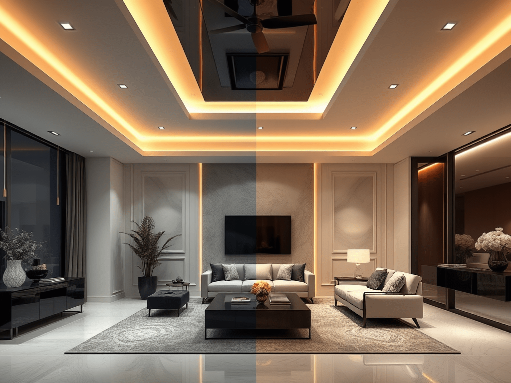
Choosing the wrong color temperature for your lighting easily ruins the mood of a luxury home. You have the most beautiful marble flooring, premium furniture, and a perfect interior layout. But, if the lighting feels harsh, cold, or inconsistent, the entire space loses its warmth and sophistication.
Why Colour Temperature Matters
Color temperature defines the emotion of a space. It’s measured in Kelvins (K), and it determines whether light feels warm and inviting or cold and clinical.
- 2700K–3000K (Warm White) – evokes comfort, intimacy, and timeless luxury.
- 4000K+ (Cool White) – creates brightness but feels sterile, like an office or retail store.
In luxury homes, people don’t want to feel like they’re under fluorescent tubes — they want glow, not glare.
The Common Mistake
Many homeowners choose cool white lighting. Some contractors also make this choice. They think it makes the space look “modern” or “brighter.” But luxury is never about utmost brightness — it’s about balance and mood.
A 4000K downlight can make your Italian marble look clean. But, it can also make your warm wooden flooring, fabrics and brass accents lifeless.
This mismatch in tones creates visual chaos — one side of the room feels cozy, the other feels icy. It’s subtle, but it’s what separates an expensive interior from a luxurious experience.
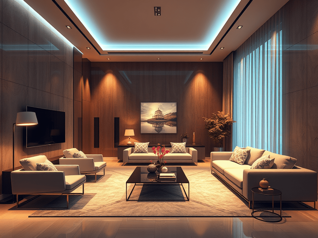
True luxury comes from layering light: a mix of ambient, accent, and task lighting.
Darkness is just as important as light—it creates drama, focus, and mood.Think of an art gallery: only the artwork is lit, while the rest is left in soft shadow. That contrast is what makes the experience feel refined.
The Correct Approach
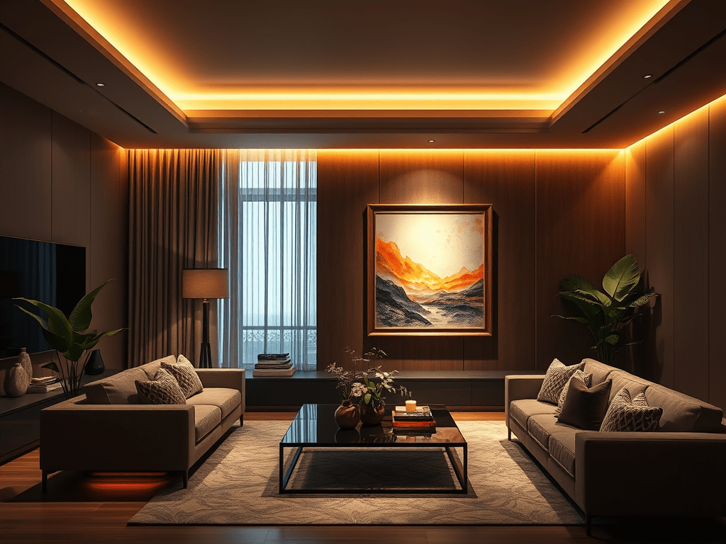
- Stick to a consistent 2700K–3000K palette for interiors.
- Use slightly cooler tones (3500K) only in utility spaces like kitchens or dressing areas if needed.
- When combining decorative and architectural lights, ensure the color temperatures match — even a 3000K difference can make the layering look disjointed.
- Always test the lighting on-site. The same light can differ against materials, wall finishes, or reflective surfaces.
Lighting Designer’s Insight
In one of my projects, the client initially selected all 4000K fittings. During mock-up, the living room felt uninviting and washed out. When we switched to 2700K, the ambiance instantly transformed. The marble gained depth. The timber felt richer. The entire room exuded quiet warmth. That’s the power of the right color temperature.
Closing Thought
Light is not just a technical parameter — it’s the soul of the space. Get the color temperature wrong, and you lose emotion; get it right, and every texture, surface, and detail comes alive.


Leave a comment